Reviews
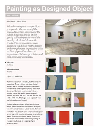
Well known as an art educator, Matthew Browne presents at Orexart sixteen paintings of vinyl tempera and oil on linen, stylishly crafted works where hints of landscape topography (seen from above) and domestic or commercial interiors (studied from a side angle) are paradoxically blended. Fourteen are 750 x 550 mm and two are 1400 x 1000 mm. The larger ones especially have sophisticated visceral impact.
Unabashedly reminiscent of Bauhaus furniture design, particularly that of office desks or say the wooden backs of stacked tubular chairs, the best works here include dark tones (encroached by paler forms) to provide considerable visual (ie. emotional) wallop. The contrast creates drama. The colours are always unmodulated, occasionally hinting at transparency through overlapping slightly organic shapes.
However in these unframed vertical linen rectangles, with their three or four dominant colours inside butted-together vaguely diamond shapes—with curved corners and solitary traversing glowing lines—elegantly simple composition comes precariously close to bland (if not vacuous) formatting. In most cases disaster is narrowly averted; the gamble using understatement (where dullness is courted but still kept at arm’s length) pays off.
Browne’s dynamic focusses on the tension of exposed and speckled brown linen versus opaque blocks of paint, soft curved corners acting as foils for hard extended vertical, horizontal or diagonal edges locked into the picture-plane. In this country they seem like a super-rarefied allusion to Quentin MacFarlane even though there is no reflective oil residue or brusherly overtones.
Also the glowing lines make the works seem related to the plexiglass sculptures of Kãryn Taylor with their incandescent edges; they hover in front of the restrained geometric compositions that allude to aerial agrarian photography.
With these elegant compositions you ponder the corners of the pressed together shapes and the subtle diagonal angles of the gently collapsing sides—and the tonally calculated chromatic triads. The compositions seem designed via digital methodology (like for example Andre Hemer), and everything is impeccable with no hint of pencil or charcoal (what’s that?) anywhere. Flatness, precision and cool geometry dominate.
Browne’s painting is knowingly about design—its own processes—as much as the world beyond the studio with its computer. This with a love of the physical qualities of objects like stretchers, and materials like linen and vinyl tempera. In true modernist style it celebrates the objectness of painting.
In other words, even in a postmodern era this is conservative painting—Browne is not a radical innovator like Arps, Cousins, Calder or Ingram who kick against studio conventions—but in its own way it is daring, and has considerable qualities where nuances of shape and colour choice provide pleasure and multiple associations around nature and culture.
John Hurrell
EyeContact
Read more: eyecontactsite.com/2019/04/painting-as-…
Under Creative Commons License: Attribution Non-Commercial