Essays
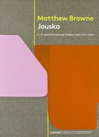
The elusive nature of perception and ambiguity of meaning unfold in new ways in Matthew Browne’s latest exhibition of works in Jouska. Possibilities of how meaning is communicated and received inform a conceptual dialogue where tensions arise between literal and non-literal observations; conscious and unconscious thoughts and actions; the familiar and unfamiliar.
The exhibition title takes inspiration from a neologism in John Koenig’s recently created Dictionary of Obscure Sorrows. A web-based lexicon designed to fill gaps in contemporary language, the dictionary comprises newly invented words that define strange social nuances and unique experiences. Jouska, for example, is ‘a hypothetical dialogue played out in one’s mind.’ The adaptation of jouska for Browne’s exhibition, and other words selectively plucked from the dictionary for the painting titles, continues the artist’s intuitive play with ideas and processes moving in the space between the familiar and unfamiliar; the conscious and subconscious.
A freshly painted canvas, like a newly invented word, moves from the unknown to the known. Here, a hypothetical dialogue is offered, opening in the space between ‘assumed meaning’ and open reception of the viewer. Meanwhile the formal relationship between shape, line and colour on the canvas anchors this dialogue at the two-dimensional surface of each work. Rather than prescribing meaning, the works invite different readings, while denying any one categorical conclusion. In other words, Browne sets up multiple horizons where meanings and potentialities can emerge through individual insight, feeling or memory.
During the last twenty years Browne’s painting practice has consistently returned to the question of the artistic subconscious as expressed through the painted surface: painting is a way to render visible images and sensations normally residing in the unconscious. What is previously unknown or invisible becomes known and visible through the act of applying pigment to canvas. The action repeats as the work evolves with each application responding to the one painted before. In this way the creative act is firmly lodged ‘in the present,’ yet undeniably draws from something dwelling deeper within; an unknown place, an essence or remnant of something else – a memory perhaps, or a passing thought.
We might come to understand Browne’s works as a metaphor for something else; each communicates a tension seeking resolution within the work. Our attention is captured through the use of strong abstract shapes, decisive lines and bold colours; this is underscored by a sense of unease borne from an asymmetry of the same shapes, lines and colours. However, the tension does not overwhelm; the responsive process is ultimately informed in the finished composition by an overall sense of order and calm. Browne thus presents works that are visually strong in the formal associations brought to the viewer, open to multiple meanings, and completed through an intuitive process that responds to the needs of each work, including a point of resolution. At this point the artistic subconscious departs and the viewer’s perception arrives.
An understanding of Browne’s working process stimulates a level of awareness when we consider the delicate relationships shared by the formal elements in each work. The bounded shapes are enclosed by curvilinear and straight-edged lines and characterised by a sense of certainty and precision. Their solid forms sit confidently on the surface, as in Ellipsism and Avenoir; or, as in Ambedo, hover transparently over lines or the natural linen canvas. They jostle with one another, pulsing with energetic and emotive colour. These are not generic shapes; rather they are stretched or squashed in relation to one another. Browne’s intent is that these forms carry through an ambiguity of meaning: irregular shapes are less resolved and less bound; more interesting and more persuasive. These shapes have a palpable certainty about them; their presence is tempered by adjacent forms and secured by solid lines that travel through, behind and alongside them.
The block colour lines are active and move freely without a predetermined goal. They serve a dual purpose that again plays on the familiar and unfamiliar theme. On one hand line offers a point of orientation; each creates a springboard that other shapes push against. Line is therefore not treated passively but actively, probing and partially propping up large shapes while fixing others. On the other hand, in some works line meanders ‘off-stage,’ moving from one edge of the canvas to another, giving no indication as to where it arrived from or where it is going. In Fitzcarraldo, for example, the tangerine line encloses a solid block, while in Ecstatic Shock a natural line turns lyrically across the bottom right corner of the canvas, a partial glimpse of its broader movement. This dynamic use of line: graceful, playful and vital, contributes multiple readings within each work.
A relationship between shape and line is, of course, dependent on another essential element: confident, vivid colour. In addition, the natural linen canvas is given precedence as a breathing space to allow balance, order and calm. Colour is an entry point to another interpretive horizon; an energetic yellow in Avenoir is unavoidable in its centrality and scale; cheerful, and cerebral in its link to cognitive thought. Meanwhile the earthy hues in Vemödalen are possibly more evocative of a landscape, without fixing meaning, and the shades of teal and solid black in Ellipsism are offset by a vivid red arching line. Each judiciously selected combination creates a specific timbre that resonates in different ways.
As with the purposeful use of shape, colour has a certain, precise role. It is familiar in one sense, yet in relationship to form and line, reverberates with an unfamiliar synaesthesia. This is possibly another metaphor for everyday relationships: sometimes what we think we see is not necessarily what is going on but a façade. In order to understand the situation we have to delve further, consciously and willingly subscribing to it. In this case, like shape and line, colour does not necessarily provide the answers we seek; nevertheless it leaves us with something that lingers, now embedded and known to us.
Elisha Masemann March 2019
